
The last week of every year, I try to reflect and make new plans. At the end of 2010 (my annus horribilis), I decided to start tracking my mood in three categories: pleasure, calm, and energy. In 2013, I added a fourth: focus.
A little crazy? Admittedly. But I was doing it before the Quantified Self was cool.
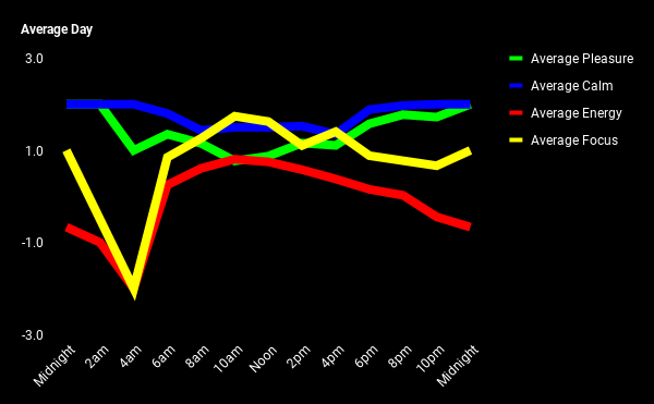
Whenever I remember to, every two hours or so I try to “check in” with myself and evaluate how I’m feeling in those four categories using a Lickert scale from -3 to 3. Averaging out all the data (like rare data points from 4am) I’ve been able to graph how I tend to feel throughout the day. For example, the graph above is an Average Day since I started working at Blue Sky.
Recently, it occurred to me that I could plot all the data since I started to see if I could discern any long-term trends or patterns.
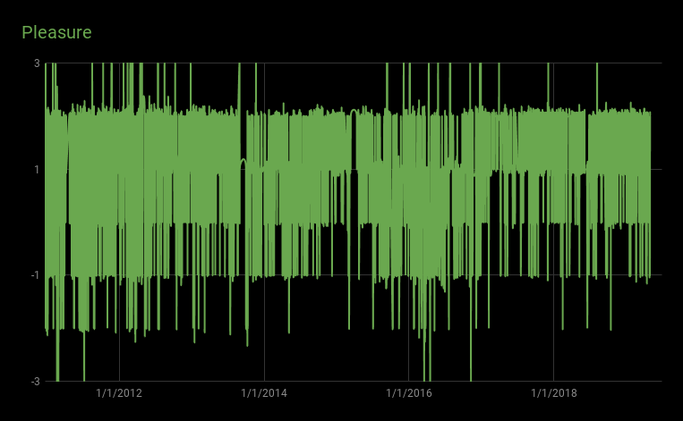
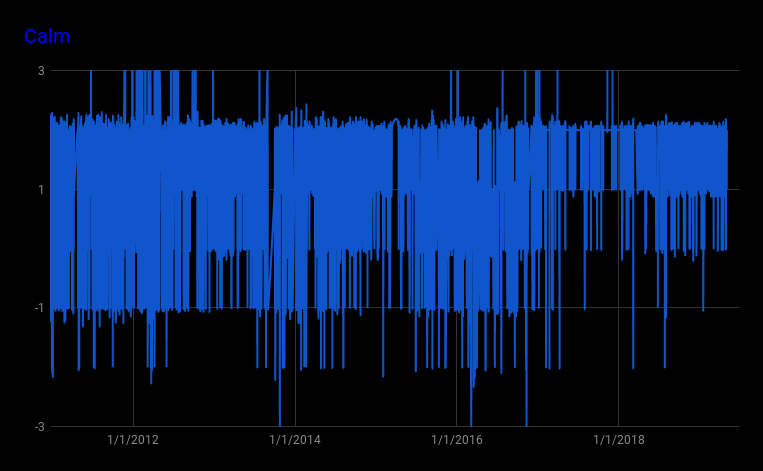

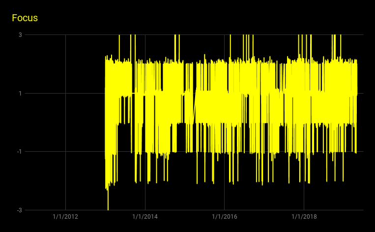
In the very middle of the Pleasure and Calm charts, you can see the rise and fall of my time in China. You can also see that I’ve generally been more happy and relaxed since moving back to the U.S. than I used to be. On the Focus chart, you can see that I’m more focused than scattered, but that might be a bias from when I was focused enough to remember to add data. On the Energy chart, I noticed that the first couple of years I had much more energy than I seem to have had in the last couple of years.
I correlated my energy level against a metric I’ve been tracking since all the way back in 1999: my weight. (I’ll spare you that roller-coaster chart.) Turns out I have more energy when I weigh less. Who knew?